This is a visualization of transactions from the Seattle Public Library, taken from a dataset of over 66 million entries collected since 2005. Through this database, I was able to experiment with various methods to filter huge collections of information, attempting to extract meaningful patterns and depict them visually. Many thanks to Professor George Legrady for gaining access to this data.
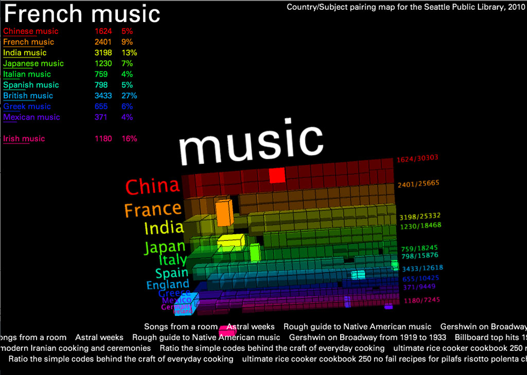
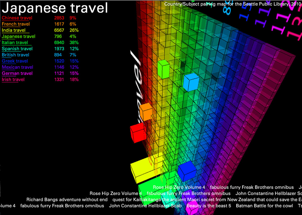
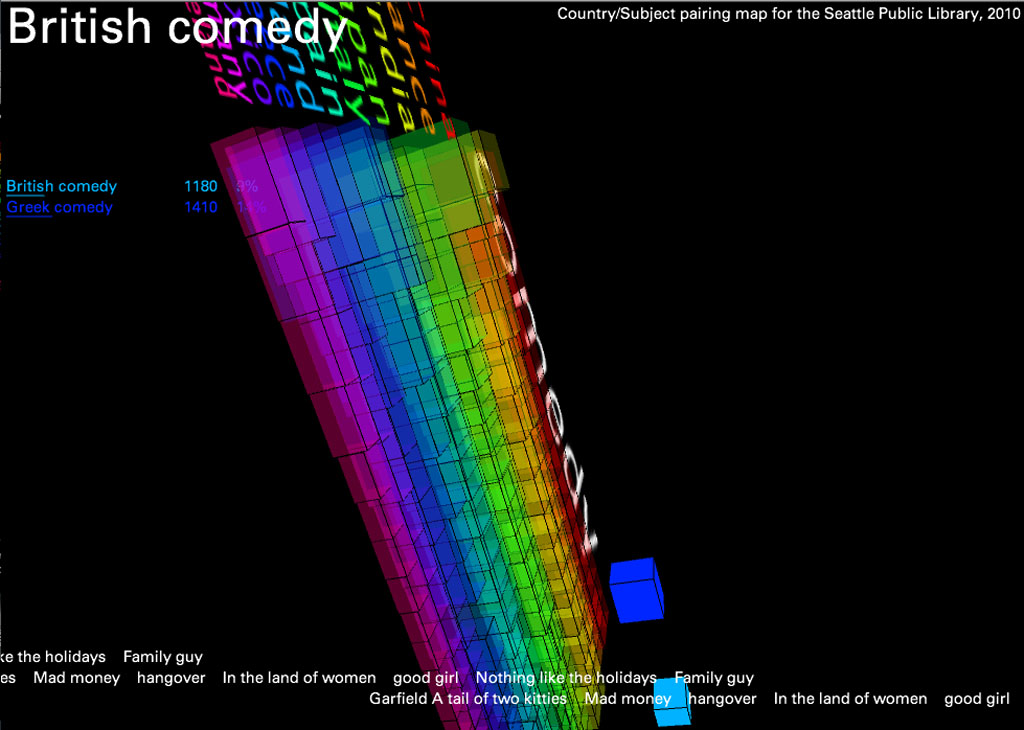
In this version, I created a 3D map of the 11 most frequently referenced countries and the words most often associated with each for all of 2010. I did this by collecting the first three subject headings for every item circulated with a title referencing a country in either noun or adjective form (for example, “china” or “chinese”). This created a large text file which I simply parsed in terms of word frequency.
The result reveals interesting trends: “war” was the word most often associated with Germany, “cooking” and “food” were important categories for every country except England and Ireland (proving the fact that no one likes British food), and “women” was one of the most words most associated with France, etc. To add another layer of information, I’ve included scrolling “trackers” at the bottom that display actual titles of items containing these subject/keyword pairs (Italian + food, etc.).
The countries are listed in order of popularity- China being first- and the 3D blocks can be read as literal representations of the volume of items checked out in each category.
Technically speaking, data manipulation and filtering was done through MySQL in conjunction with some fancy BASH scripts, and all of the visualization was done in Processing. If you’re curious, please feel free to download the source code and try it for yourself.